 Our product is the BEST.
Clinical tests prove that in 128.3%
raesentP iaculis, elit eget convallis gravida, nulla urna gravida elit, eu eleifend purus nunc eu sem. Donec accumsan ipsum vel orci volutpat eleifend cursus erat congue. Suspendisse lacinia consequat aliquam. Proin eget odio non risus sodales blandit non a ante. Sed sollicitudin nisl id nunc mattis sed gravida quam accumsan..
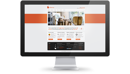
 This is space that I call slogan area. It’s purpose is to drive your att-
ention to something important, like button that will say «buy me!»
Proper coding
![]() Etherna looks great in all the major browsers, even the older ones. It’s been tested with Ie7, Ie8, Ie9, FireFox3, FireFox4, Chrome, and Opera.
Etherna looks great in all the major browsers, even the older ones. It’s been tested with Ie7, Ie8, Ie9, FireFox3, FireFox4, Chrome, and Opera.
Attention to details
![]() User-experience often suffers when form is a factor, but not this time. My goal was to make something that I myself would love to use.
User-experience often suffers when form is a factor, but not this time. My goal was to make something that I myself would love to use.
Modern and beautiful
![]() Solid typography and modern, perfect layout. Theese two work together to deliver best possible readability, and make your website a joy to explore.
Solid typography and modern, perfect layout. Theese two work together to deliver best possible readability, and make your website a joy to explore.
Smart and flexible
![]() Containers and columns system will save your time greatly, and will let you focus on the most important part of your website, the content.
Containers and columns system will save your time greatly, and will let you focus on the most important part of your website, the content.
